As bold online
as on social
VÄCKA, aligning a rebel plant-based cheese brand's website with its voice, from Instagram to the store shelf.

OVERVIEW
CONTEXT
Client project during the Ironhack UX/UI Bootcamp, in a team
TIME
2 weeks
TOOLS
Figma, FigJam, Photoshop, Google Forms
CLIENT
VÄCKA, a plant-based cheese brand from Barcelona
THE PROJECT
The challenge
Väcka had a bold, activist and funny voice on social media, but its website didn't sound like the brand. Customers also struggled to find where to buy it, which led to awkward moments in shops with no stock.
Brand decision
Make the website as bold as the brand, and connect the whole path to purchase: from an Instagram post to the product page and a store locator that tells fans where to find the cheese.
My role
I ran the stakeholder and consumer interviews and shaped the design concept, translating Väcka's existing identity to the web, working closely with the team.
Results and why the idea works
The prototype was handed over to Väcka and implemented on its live website. What made the idea work:
One voice across channels. The website now sounds like the brand people follow on social.
It removes the main barrier to purchase. Knowing where to buy turns interest into a visit to the shop.

The result
A website as bold as the brand: Väcka's rebellious Instagram voice, now on its website, and a store locator with shop and restaurant filters and stock-availability estimates, so fans know where to find the cheese before they leave home.

The market
Before designing anything, we mapped the competition. Big brands grow but lose taste; small artisans keep the taste but can't scale. Väcka grows without sacrificing quality, a position worth defending and the starting point for everything that followed.

The consumer
An interview with Väcka's CEO and co-founder, 8 consumer interviews and a survey of almost 40 fans. The insight: people loved the brand on social media but felt lost on the website, with no product information, no idea where to buy, and empty shelves at the store. Their journey went from love at first sight to disappointment.

The brand experience
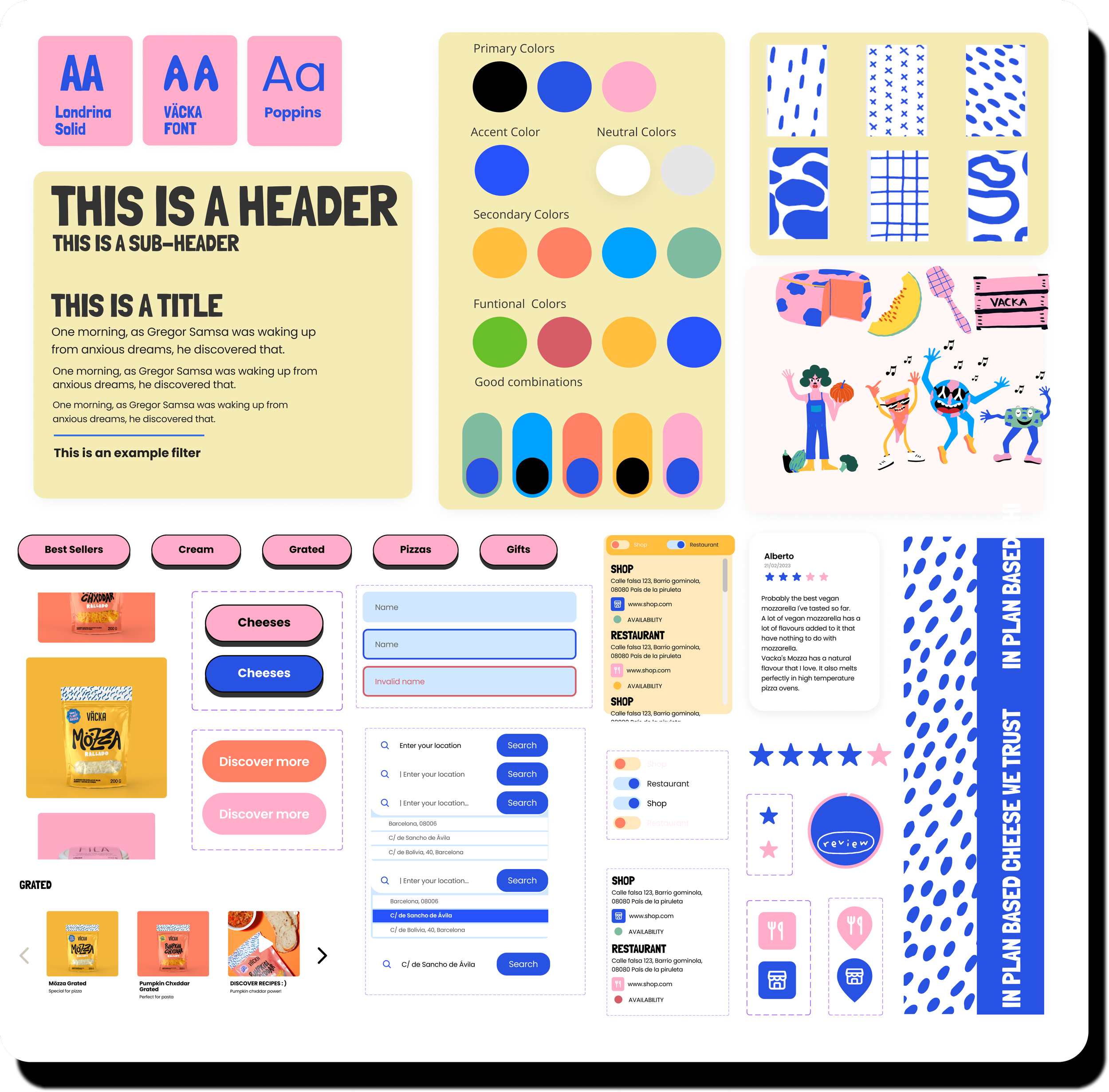
Four brand attributes (activism, humour, humility and ambition) translated into colour, type and a horizontal scroll that breaks web conventions, just like the brand does.
Tested with real users
Testing showed the store map was the most frustrating part of the experience, so we redesigned it around what fans actually needed:
Separate shops from restaurants.
Filter the search by type of store.
Show estimated stock availability for each store.
From low to mid fidelity:

